Notes
Questions
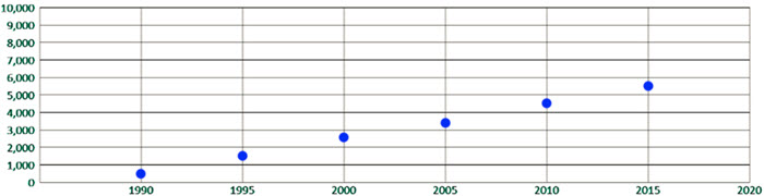
\(\textbf{1)}\) Draw the scatterplot.


\(\textbf{2)}\) Find a prediction equation.
\(\textbf{3)}\) Predict the population in 2020.
In Summary
A scatterplot is a graphical representation of a dataset that uses plotted points to show the relationship between two variables. It is commonly used in statistics and data analysis to visualize the relationship between two variables and to identify any patterns or trends in the data.
To create a scatterplot, the values of one variable are plotted on the horizontal axis and the values of the other variable are plotted on the vertical axis. Each pair of (x, y) values is then plotted as a point on the scatterplot. The resulting plot shows how the two variables are related, and can reveal any patterns or trends in the data.
Scatterplots are often used to investigate the relationship between two variables and to identify any correlations or patterns in the data. For example, a scatterplot could be used to investigate the relationship between a person’s height and weight, or between a company’s sales and advertising expenses. Scatterplots can also be used to identify potential outliers in the data.