Practice Problems
See the pie chart below on 200 items of produce.
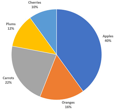
\(\textbf{1)}\) How many apples are there? (Hint: 200 items of produce total)
The answer is \( 80 \) apples
\(\textbf{2)}\) How many cherries are there?
The answer is \( 20 \) cherries
\(\textbf{3)}\) How many carrots are there?
The answer is \( 44 \) carrots
\(\textbf{4)}\) How many plums are there?
The answer is \( 24 \) plums
\(\textbf{5)}\) How many oranges are there?
The answer is \( 32 \) oranges
See Related Pages\(\)
In Summary
A pie chart is a circular graph that is used to show the relative proportions of different categories or groups. It is divided into segments, with each segment representing a different category and the size of the segment representing the proportion of the data that belongs to that category. To create a pie chart, the data is first organized into categories, and then the total value for each category is calculated. The proportions of each category are then represented as angles in a circle, with the total value for each category represented by a corresponding fraction of the circle. Pie charts are a useful tool for visualizing the relative proportions of different categories in a dataset and for comparing the proportions of different groups.